Rinaldo Rinaldi’s colour palette for Spaziocontinuo®
The palette
Each of the 27 nuances are represented by a two-digit number. The first digit, which varies from left to right, represents a colour scheme (three shades of NEUTRAL colours and four PASTEL colours). The second digit varies from top to bottom and represents the brightness of a given nuance.
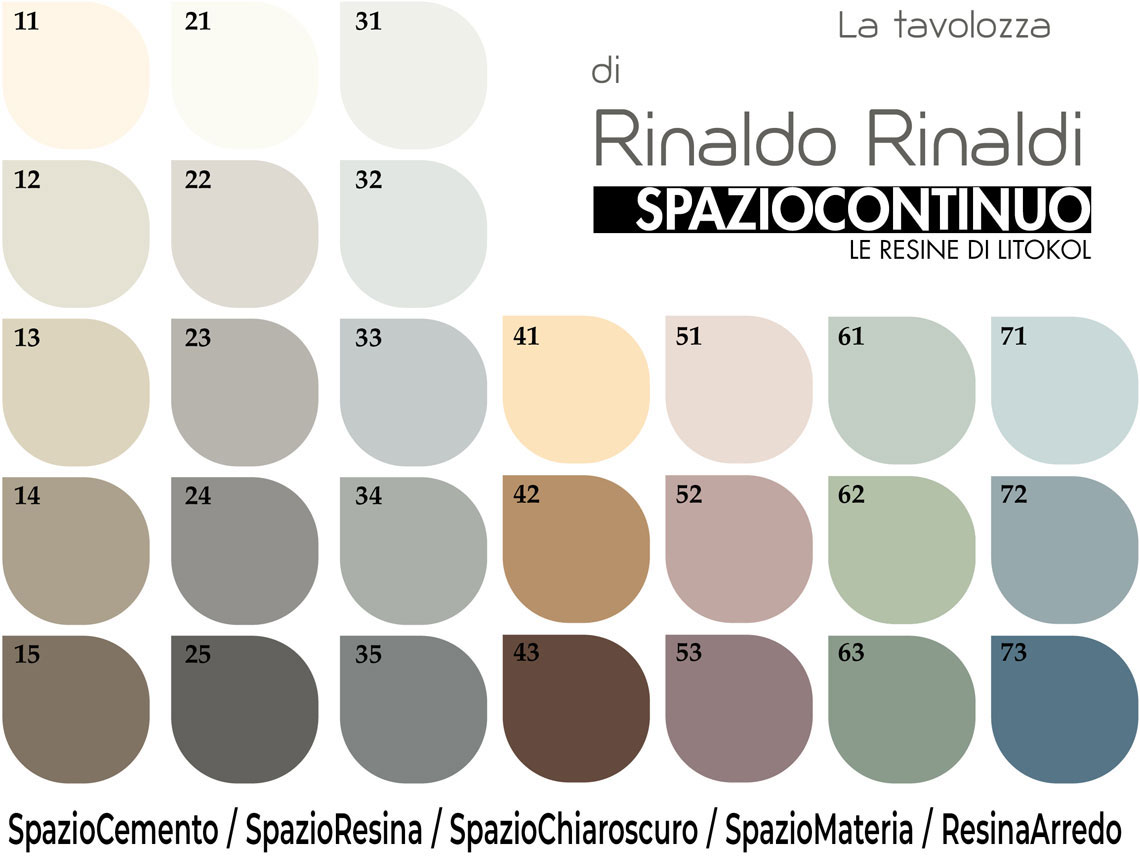
Neutrals
These express a strong sense of purity and harmony, creating interesting plays of light and shade; they can be associated with several other colours, thus allowing the emphasis of both light and dark tones.
They are divided into three shades: WARM, GREY and COLD, which are in turn available in five levels of brightness. For a total of 3 x 5 = 15 NEUTRAL nuances.
The lighter colours illuminate and warm the atmosphere, while the darker colours give character and elegance.
Pastels
This collection is split into four colour schemes with three different levels of brightness.
A total of 4 x 3 = 12 PASTEL nuances designed to adapt to all interior styles. For example, if combined with essential furnishings in light and natural tones, they create a sense of freshness and lightness. If combined with metallic colours or oxidised effects, the result is more elegant and chic.
Combinability
The choice of two or more colours in an horizontal direction allows the combination of nuances with the same intensity and brightness, for a more balanced result.
The choice of two or more colours in a vertical direction creates a more discrete chromatic effect, playing with different shades of the same colour.
Alternatively, NEUTRAL and PASTEL nuances can be combined to make a room either more harmonious and welcoming, or dynamic and contrasting.